
How to Create Google Forms Reports
Published: 2 years ago
Data can be intricate, but visuals simplify comprehension. For small businesses and entrepreneurs, a well-constructed graph or chart can enhance communication with peers or investors. You can effortlessly convert Google Forms results into a pie chart.
While Google Forms provides a basic pie chart for individual use, Google Sheets allows for the creation of more detailed and tailor-made pie charts for presentations.
In this guide, we'll demonstrate how to transform your Google Forms data into an elegant pie chart, ready for download and sharing with your colleagues. Additionally, we'll discuss the advantages of using a pie chart from Google Forms.
Pie charts stand out as one of the most intuitive methods to visually represent data, especially when we want to display proportional differences within a dataset. For Google Forms responses, they offer several key benefits:
Simplicity: Pie charts are straightforward and easy to interpret, making them ideal for audiences unfamiliar with the dataset or those who prefer visual over textual information.
Immediate Insights: At a glance, viewers can discern the dominant categories and how responses are distributed, without needing to delve into raw numbers.
Comparative Analysis: When you have multiple pie charts from different forms or datasets, it's easier to compare and contrast the distribution of responses.
Engagement: Visually appealing and colorful, pie charts can make presentations more engaging and can be a powerful tool in discussions, meetings, or reports.
Space Efficiency: Pie charts summarize a lot of information in a compact space, making them an excellent choice for infographics, reports, or digital content where space is a premium.
Given these strengths, pie charts serve as an invaluable tool for anyone looking to represent Google Forms responses in a meaningful and captivating manner.
When working with Google Forms, the "Responses" tab is a pivotal location for accessing and evaluating the data collected from respondents. Among the visual tools at your disposal in this tab, the pie chart stands out for its ability to present data in a digestible manner.
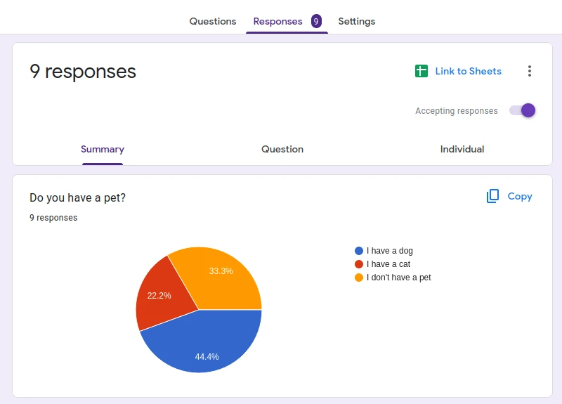
A pie chart is a visual representation of categorical data, where each 'slice' corresponds to a specific category and its size indicates the frequency or percentage of occurrences within that category.
In Google Forms, after collecting responses, you can head to the "Responses" tab to view a summary of the answers. For questions with a fixed set of potential answers, such as multiple choice or dropdown questions, Google Forms automatically produces a pie chart. This visual representation offers an immediate understanding of the distribution of answers, helping users identify trends without needing to analyze each individual response.
For those who require further customization or wish to download their pie charts, Google Sheets comes into play. By linking Google Forms to Sheets, users can harness advanced data manipulation and charting tools. This means that not only can you visualize data in more nuanced ways, but you can also save these charts for presentations, reports, or further analysis.
To summarize, the pie chart in the "Responses" tab of Google Forms provides a quick and efficient way to visualize survey data. When paired with Google Sheets, the possibilities for customization and data utilization are greatly expanded.
Google Forms excels in data collection, while Google Sheets offers robust data visualization tools. Together, they form a dynamic duo for those seeking to effectively represent their data. This guide will explore how to harness the combined strengths of both platforms to create and customize compelling pie charts that make your data stand out.
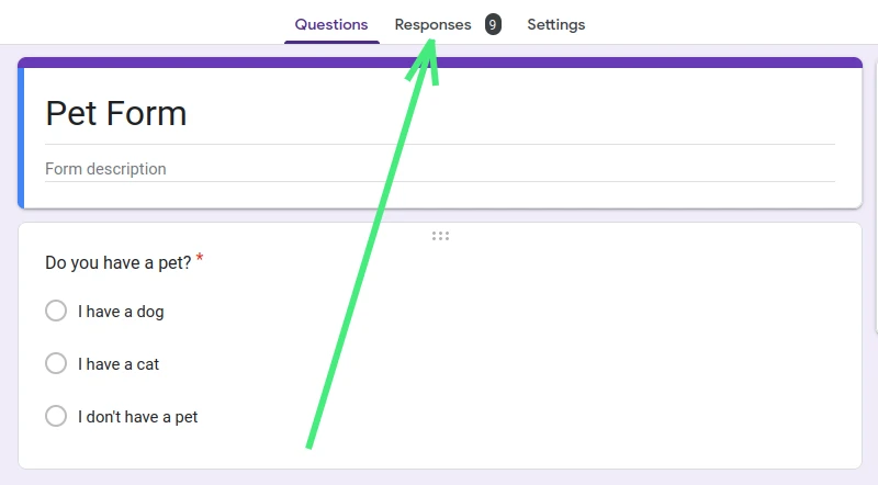
Once you've crafted your form and shared it, your first action should be to access the "Responses" tab, which is prominently positioned as the second option at the top of your form. This is where all submitted responses from your audience are collated.
After reviewing the data in the "Responses" tab, if you're looking for a visual representation, particularly a pie chart, transitioning to Google Sheets will provide you with the tools and flexibility you need for a polished and comprehensive visualization.
In the upper-right corner of the "Responses" tab, you'll notice the Google Sheets symbol. By clicking on this icon, you'll be directed to the Google Sheet where all your responses are aggregated. From here, we'll guide you through the creation, modification, and customization of pie charts using Google Sheets.

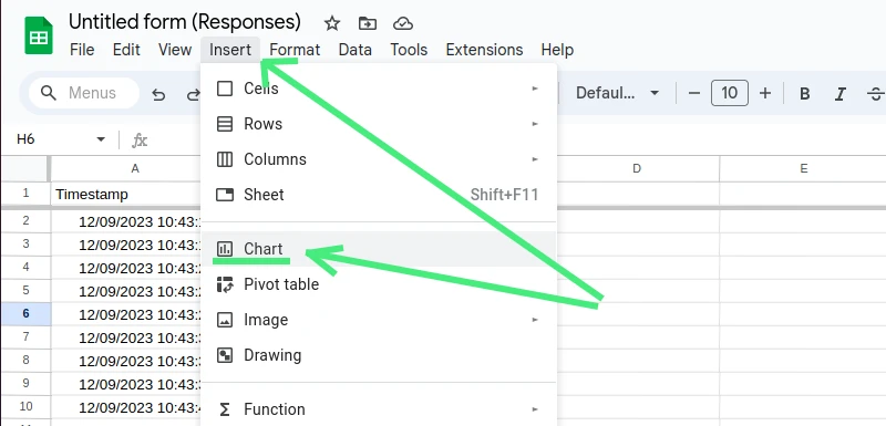
Begin by opening your Google Sheet and highlighting the cells containing your form responses. Simply click on the initial cell and drag your cursor to encompass all relevant cells.
Next, navigate to the top menu and choose "Insert," followed by "Chart." A selection window will appear, presenting various chart styles. Opt for the "Pie chart" from the given choices.
Within the "Setup" tab, you'll have the opportunity to refine your pie chart's format. While the automatically generated chart likely captures your needs, any desired adjustments or enhancements can be made in this section.
Once your pie chart is in place, Google Sheets offers an array of customization options. Let's navigate through them:
Chart Style: Begin with the "Chart Style" option. Here, you can adjust the background color, font, and chart border color. Two noteworthy checkboxes are "Maximize" (optimizes the chart size by reducing excess borders) and "3D" (gives your chart a three-dimensional look).
Pie Chart Settings: Delve into the core "Pie chart" settings next. Adjust the central hole's size, modify the chart's border color, or tailor the labels of each segment—including their font and hue.
Pie Slice Adjustments: For granular control over each pie segment, head to the "Pie slice" tab. Here, you can set individual slice colors, adjust their distance from the center, and customize slice titles.
Chart and Axis Titles: Under this section, refine the main chart title and manipulate axis labels. Alter the text, font, formatting, and color. A handy drop-down at the top lets you toggle between the primary chart title and various axes.
Legend Modifications: The concluding "Legend" section provides controls for the legend's position, font, and color. The position drop-down is particularly useful for optimizing the placement of the legend.
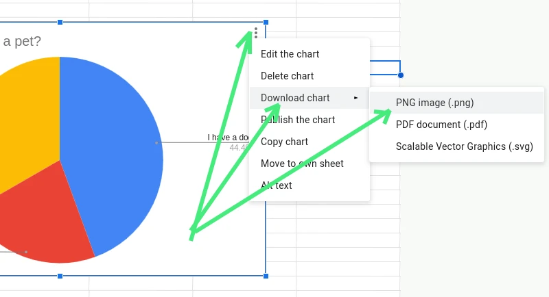
Once you've fine-tuned your pie chart to satisfaction, it's time to export it. Locate the three-dot icon at the upper-right corner of your chart and click it. By choosing "Download," your pie chart will be saved as a PNG file, ready for inclusion in any document. Alternatively, you can opt to save it as a PDF.
And voila! You're now equipped with a polished pie chart from Google Form, primed for your upcoming presentation.
Navigating the world of data visualization, pie charts stand out as a straightforward and visually appealing method to represent data. When coupled with the right add-ons, these charts can be transformed into powerful tools, offering deeper insights and a richer analysis of the collected data. Let's explore how add-ons can amplify the potential of your pie charts.
Google Forms is an indispensable tool for gathering data, but what if you could unlock a more nuanced perspective, especially when visualizing data using pie charts? Advanced Summary might be just what you need. While it doesn't claim to revolutionize the process, its capabilities are certainly noteworthy.
Advanced Summary amplifies the depth at which you can dive into your Google Forms responses. Through intuitive filters, it allows users to represent their pie chart data in ways that Google Forms' native charting may not capture comprehensively.
The standout features of Advanced Summary include:
Real-world Applications: Whether it's offering a deeper insight into academic research, fostering community connectivity, streamlining educational feedback, or providing businesses an edge in survey analysis, Advanced Summary's capabilities shine.
Amidst an ocean of data, the right visualization tools act as a beacon, illuminating vital insights. Among the emerging add-ons for Google Sheets, ChartExpo™ is an indomitable force in transforming spreadsheets into powerful visual stories. Let's explore its capabilities:
The Power of Simplicity While spreadsheets are adept at collecting and organizing data, their true power is manifested when complemented with effective visualization tools like ChartExpo™. "Simple" doesn't mean basic. ChartExpo™ celebrates the art of converting intricate data problems into insightful visuals, leading to profound revelations.
Bridge the Gap Between Data and Insight The conundrum today isn't the lack of data; it's the overwhelming nature of it. ChartExpo™ alleviates the need for endless manual analysis, allowing users to craft impactful visualizations with just three clicks. It's not just about seeing the data; it's about understanding it.
Dive Deeper with ChartExpo™ ChartExpo™ isn't merely a charting tool; it's a voyage into the heart of your data. From network diagrams, sentiment graphs to detailed financial charts like Energy Flow Diagrams, it caters to diverse data visualization needs. With a robust suite featuring over 60 chart types, including the Sankey Diagram, Radar Chart, Pareto Chart, and many more, there's a visual representation for every conceivable data point.
Customize, Share, and Collaborate Beyond crafting visuals, ChartExpo™ offers a rich framework for customization, ensuring each chart aligns perfectly with your presentation needs. Once created, you can effortlessly download, embed, or share your charts across various platforms, enhancing collaboration and communication.
Empower Every Professional Whether you're a data scientist, BI specialist, financial analyst, journalist, or even a researcher, ChartExpo™ transforms the way you make critical business decisions. Industries ranging from health care, government relations, sports, education, entertainment to many more can leverage the might of ChartExpo™.
Versatile Data Integration Pull data seamlessly from various sources like Google Forms, SurveyMonkey, or even PostgreSQL. Even without coding experience or knowledge in Python or related libraries, ChartExpo™ offers a codeless environment for powerful data storytelling.
Pricing Experience the power of ChartExpo™ with a risk-free 7-day trial. Post-trial, the service is priced at $10 per user per month, making sophisticated data visualization accessible to every professional.
ChartExpo™ empowers users to navigate through complexities with ease, discovering hidden patterns and insights. Simplify your spreadsheets, explore ChartExpo™, and redefine the way you visualize and interpret data.
The ability to visually interpret data is invaluable. Google Forms, known for its data collection capabilities, combined with the illustrative power of pie charts, provides a compelling way to transform numbers into insights. Whether you're a business owner, researcher, or educator, embracing pie charts to visualize your Google Forms data not only simplifies comprehension but also fosters better decision-making and communication. Dive into this synergy and turn your raw data into a visual story that speaks volumes.
Related Articles
Just discovered Nerdy Form? Try our free form builder now!
Sign up for FREE