
How to Add a Multiple-Choice Grid to Google Forms
Multiple-choice questions don't always suffice when you want to dive deeper into a subject. To unravel the complexities of specific issues, multiple-choice grid questions offer a much-needed tool. Google Forms supports this feature natively, but using it effectively can be a bit of a challenge.
In this guide, we will walk you through the process of setting up a multiple-choice grid in Google Forms. We'll also shed light on a more streamlined and user-friendly alternative for these complex question types.
Overview
Google Forms includes a feature that allows you to create multiple-choice grid questions. To add this type of question to your form, select 'Multiple-choice grid' from the question type list. This creates a grid with rows and columns for your question.
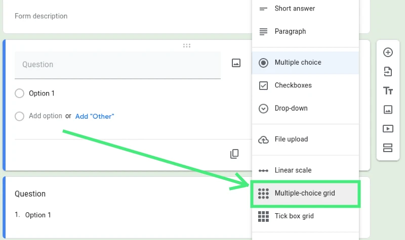
In the context of this guide, we created a customer satisfaction survey. We listed the aspects of the customer service experience we wanted feedback on in the rows, and the satisfaction ratings in the columns.
You'll also find an option to 'require a response in each row'. Activating this ensures that users will have to rate each item on your grid before they can submit their responses. Other options include limiting responses to one answer per row/column and randomising the row order. These settings are located at the bottom of the question field.
However, a significant drawback of Google Forms' multiple-choice grid feature is that it doesn't display properly on mobile devices. Given that 60% of web traffic comes from mobile devices, this is a substantial limitation.
A more effective option could be to use a premium form builder. Such platforms usually come with a feature that automatically adapts grids to mobile devices, ensuring a seamless user experience regardless of the device used.
What is a Multiple-Choice Grid?
A multiple-choice grid, also referred to as a matrix field, is a flexible way of asking several questions that share the same set of potential answers. This grid lists the questions or topics as rows, and potential answers as columns. Respondents then select the relevant intersection.
Say you want feedback on various aspects of your retail business, like the overall experience, the checkout process, and in-store cleanliness. A multiple-choice grid will allow you to group related questions, making the feedback you receive more specific and actionable.
Not only are multiple choice grids ideal for customer service surveys, they also work well for any field that requires respondents to select one option from a list of predetermined choices, such as sign-up sheets or true/false questions.
Differentiating Between a Multiple-Choice Grid and a Tickbox Grid
Among the 11 types of questions that Google Forms supports, the multiple-choice grid and the checkbox grid are easily confused. The primary difference between them is the ability to limit responses to one choice per row, a feature only available with the grid.
-
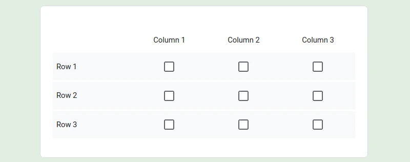
Checkbox Questions: Perfect for "select all that apply" scenarios like preference forms, demographic questions, or detailed surveys. These questions allow respondents to select all suitable answers, not just one.
-
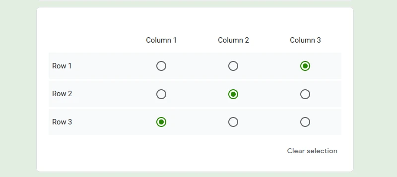
Multiple-Choice Grids: Ideal for questions that make sense only with one answer, like most quizzes, customer feedback forms, or rating scales.
Creating a Multiple-Choice Grid in Google Forms
Setting up a multiple-choice grid in Google Forms can seem daunting, but following these steps can simplify the process:
1. Adding the Multiple-Choice Grid
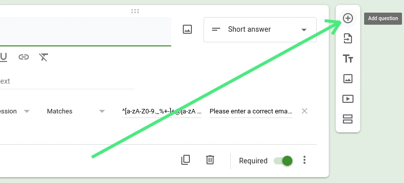
First, go to Google Forms and either create a new form from scratch or choose a template. Once your form is open in the editor, select 'Add Question' from the right sidebar. This adds an empty question field to your form. You can then title your question by clicking on the text box.
By default, your question type will be set to multiple-choice. You can change this by going to the dropdown menu and selecting 'Multiple Choice Grid'. This splits your question into rows and columns.
2. Setting up Your Rows and Columns
Next, decide what goes into the rows and what goes into the columns. Typically, questions or topics belong in rows, and answers belong in columns.
In our example of a customer satisfaction survey, we'll put the aspects of the customer service journey we want feedback on in rows and the rating system in columns.
Begin by selecting row 1 and typing your first grid item. From there, select 'Add Row' to include and label as many topics as needed. Adding columns is similar—select 'Add Column' and label each answer option individually.
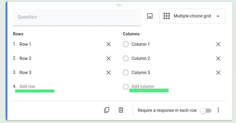
It's not necessary to have the same number of rows as columns. However, to avoid overwhelming your respondents, it's best to keep the numbers to a minimum.
Note: If your grid requires more than five rows or columns, it might be better to divide your question into multiple fields.
3. Configuring Your Settings
You can tweak the settings of your multiple-choice grid by selecting the three-dot menu at the bottom right-hand corner of the field. Here, you can add a description to your question, randomise the row order, or limit your responses to one choice per column.
To make sure you gather all the feedback you need, toggle the 'Require a response in each row' switch to 'On'. This will require respondents to rate each item on your grid before they can submit their form responses.
4. Previewing Your Multiple-Choice Grid
Before publishing your form, preview it by selecting the eye icon from the top right of the form editor. This allows you to ensure your form settings, question labels, and instructions are all correct.

After this, your multiple-choice grid is ready to start collecting valuable data. If you need to tweak your form, add conditional logic, or close your Google Form at a specific date, you can do so in the form editor.
Challenges of Using Multiple-Choice Grids in Google Forms
Creating matrix fields in Google Forms comes with two main hurdles: a limited selection of field types and a lack of mobile optimization.
-
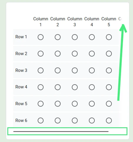
Grids Not Mobile-Friendly: Over 60% of web traffic comes from mobile devices, which surpass desktops and tablets combined. Hence, forms must be optimized for mobile devices. Unfortunately, Google Forms' multiple-choice grids do not display properly on mobile, forcing respondents to scroll to view the full set of questions and answers. When crammed into a mobile screen, grids can become squished and hard to read.
-
One Tool for Many Jobs: Google Forms offers a limited number of field types, which leads to the multiple-choice grid being used for more purposes than it is designed for. It's frequently used to create ranking questions, rating questions, true/false questions, matching questions, and more, despite the lack of native fields for these requirements. This lack of flexibility can lead to confusion for respondents and can potentially lower form completion rates. Although the multiple-choice grid is a versatile tool, it can't adequately handle tasks that would be better served by more specialized form fields.
Conclusion
Harnessing the power of multiple-choice grids in Google Forms can give you more detailed insights into your data collection efforts. These matrix fields are versatile, facilitating better organization and more specific responses, especially in scenarios where questions share the same set of potential answers. However, these grids do come with limitations, such as a lack of mobile optimization, which can impact your form's user experience and response rate.
When these limitations become a hurdle, considering alternative methods of data collection becomes important. Platforms like Nerdy Form are excellent choices as they offer an extensive variety of form fields, allowing you to customize your data collection tools to fit your specific needs. These platforms prioritize user experience, ensuring that your forms are not just effective in collecting data but also offer an excellent interface to the respondents.
Remember, the effectiveness of your survey or form depends not just on the questions you ask, but also on the experience you offer to your respondents. Strive for a balance between detailed data collection and a seamless user interface to achieve your goal of garnering valuable feedback.

